Why I built it
Most retail investors eventually hit the same wall: either there's too much noise online when it comes to trying to make an investment decision or the information you need is hidden behind a paywall. When I was in the middle of building my own personal portfolio, I wanted a workflow that felt closer to an “investment workbench”—fast enough to explore ideas, deep enough to trust, and simple enough to use daily.
This project is my attempt to bridge that gap: an open-source stock screener that aggregates signals across fundamentals, technical indicators, and sector-aware metrics, then translates the result into actionable summaries rather than a pile of raw ratios, effectively making the decision to click 'buy' in my brokerage account a lot more data-driven.
What it does (in one pass)
Once you're ready to consider adding a stock/ETF to your portfolio, the idea was you'd head to the screener. Upon searching your desired security it will:
- Pull financial + company data from the Financial Modeling Prep API
- Computes a multi-factor score (0–100) across several dimensions
- Produces ratings (undervalued → overvalued) and a recommended action (buy/hold/sell bands)
- Surfaces “why” through drill-down views and charts
- Lets you export the analysis for later comparisons
The core idea is not "predict the market." It's to reduce analysis friction by distilling all of the core analysis metrics used to assess an asset's worthiness, ultimately keeping decisions anchored to a repeatable framework.
Screenshots
Main Dashboard
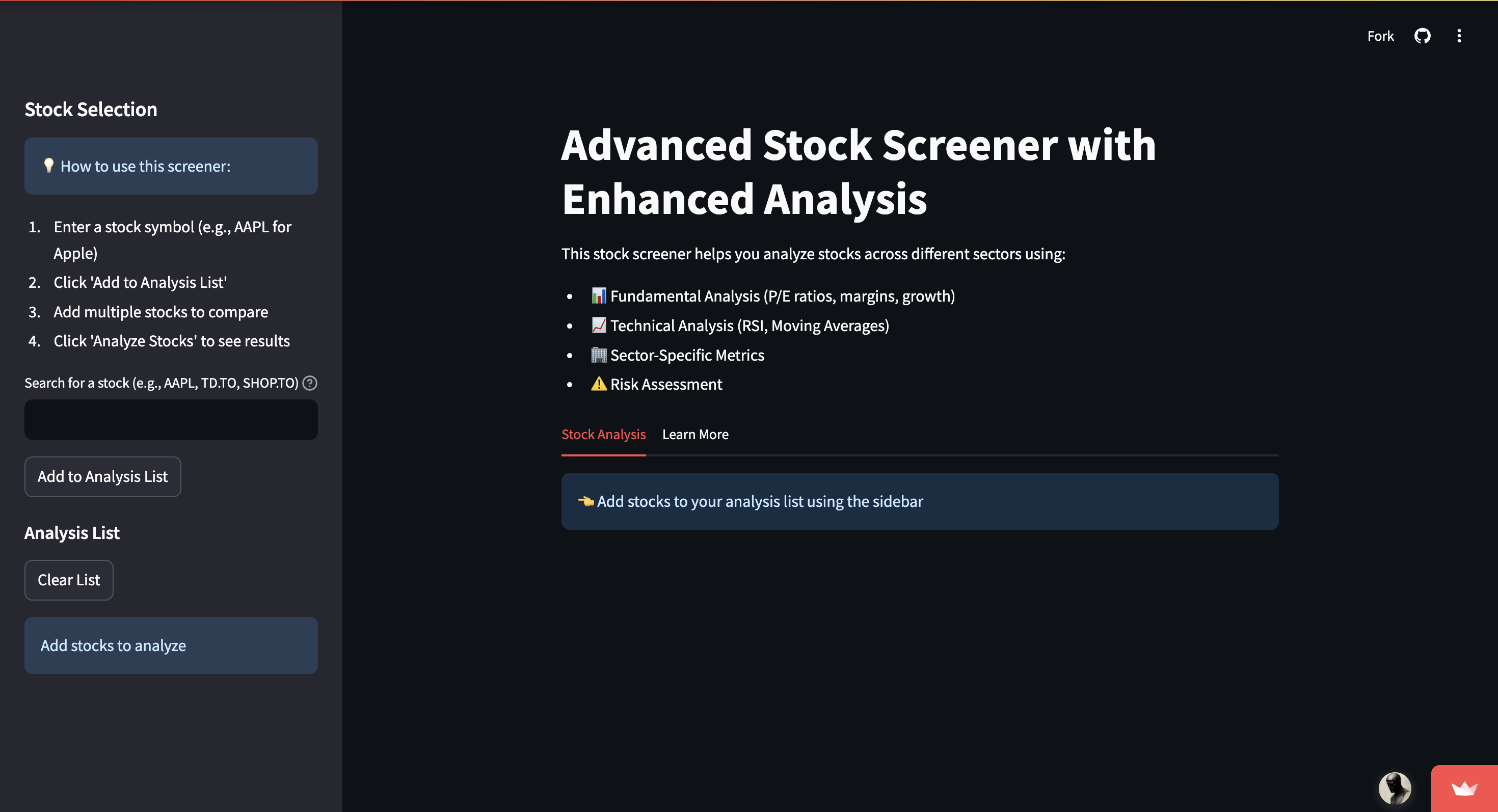
Interactive screener interface showing search and analysis options
Summary View
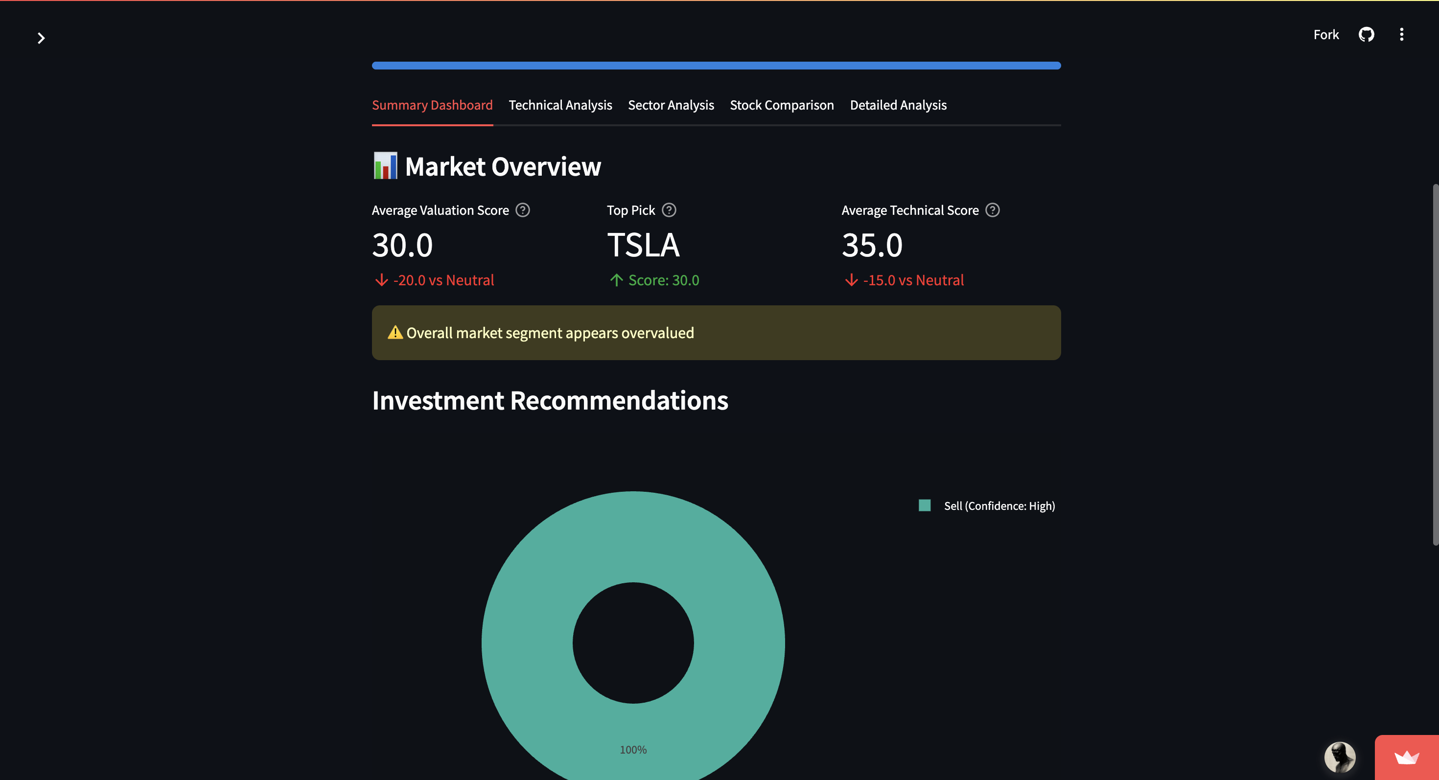
Comprehensive summary view with multi-factor scoring and recommendations
Architecture (simple, but intentional)
I designed the codebase around three responsibilities:
-
Data access + normalization
Fetch and standardize raw data into a shape the rest of the app can trust. -
Scoring and interpretation
Convert raw metrics into comparable scores, then into human-readable conclusions. -
UI as a decision surface
Present the outcome as a workflow: summary → drill-down → export.
If you want to extend the project, that was the original mental model when building it: treat it like a pipeline.
Scoring philosophy (what makes this different)
Many screeners bias toward one axis (only technicals, only fundamentals, only sentiment etc.). I wanted a balanced approach that can be tuned—so the tool stays broadly useful even if your strategy changes.
Multi-factor scoring
At a high level, the screener assigns weights across three categories:
- Base fundamentals (majority share)
- Technical indicators (supporting signal)
- Sector-aware metrics (context and nuance)
Scores are mapped onto an interpretation band (e.g., 80–100 = significantly undervalued). The point isn’t to claim certainty; it’s to make tradeoffs visible and consistent.
Practical note: The weights are meant to be edited. If your style is more technical or more macro-driven, the scoring should reflect that. I placed a higher value toward fundamentals for example, as I felt it helped better with assessing a company's worth at today's given price.
Data constraints and how I handled them
I built the project to work with free-tier limits where possible, which forced real engineering decisions:
- Caching: reduce redundant fetches and improve UI responsiveness
- Batching: group calls where feasible to stay within rate limits
- Graceful degradation: if a metric can’t be fetched, the app should still run and tell the user what’s missing
This matters because a screener that fails mid-session isn’t “free”—it costs attention and confidence.
UX decisions I cared about
The dashboard is intentionally structured around how people actually evaluate stocks:
- Summary view: “What’s worth my time right now?”
- Technicals: “Is price action confirming or contradicting the story?”
- Sector metrics: “Is this company strong for its sector, or just strong in isolation?”
- Details + export: “Can I save this and revisit later without redoing work?”
I treated the UI as an analysis narrative, not a collection of charts.
What I learned building it
A few takeaways that changed how I think about financial tooling:
- Scoring is storytelling. If you don’t explain the score, you’re just hiding assumptions behind math.
- Consistency beats cleverness. A repeatable framework you can refine is more valuable than a fragile “genius indicator.”
- Sector context matters. Comparing metrics without sector expectations can mislead more than it helps.
- The best feature is speed. A tool you’ll actually use weekly is better than a tool you admire once.
- Broader Understanding of the Stack. Taught me tons about how to deploy web apps through Streamlit, made it a lot easier as—at the time—had limited frontend experience.
How I’d evolve it next
If I were taking this from “useful personal tool” to “community-grade platform,” I’d focus on:
- Backtesting hooks: let users validate scoring hypotheses over historical windows
- Custom strategy profiles: save different weight configurations (growth vs value vs momentum)
- More data sources: macro indicators, sentiment, alternative data—carefully gated behind toggles
- Evaluation framework: a regression suite of tickers + expected outputs to prevent changes from silently breaking behavior
- Performance pass: async fetch orchestration and better caching invalidation policies
- Social Features: Social interactions would be a cool feature I think as well, the ability to comment on securities to give the user an idea of what the 'market' is saying
- Stand this up as it's own application: Would be open to maybe revisiting this project and building a complete front end perhaps using frameworks like React TS
Closing
I built this screener because I wanted analysis tooling that was accessible, transparent, and modifiable—a framework you can reason about and improve, rather than a black box you rent.
If you build on it or have ideas for additional datasets/metrics, I’m happy to iterate.